Max Duggan Portfolio
For my personal site branding, I used a black & White color scheme to make the work content pop. I made the original logo by drawing my name out of a continuous folded line, and then defining a custom shape by pulling out the angles of the line.

UX/UI
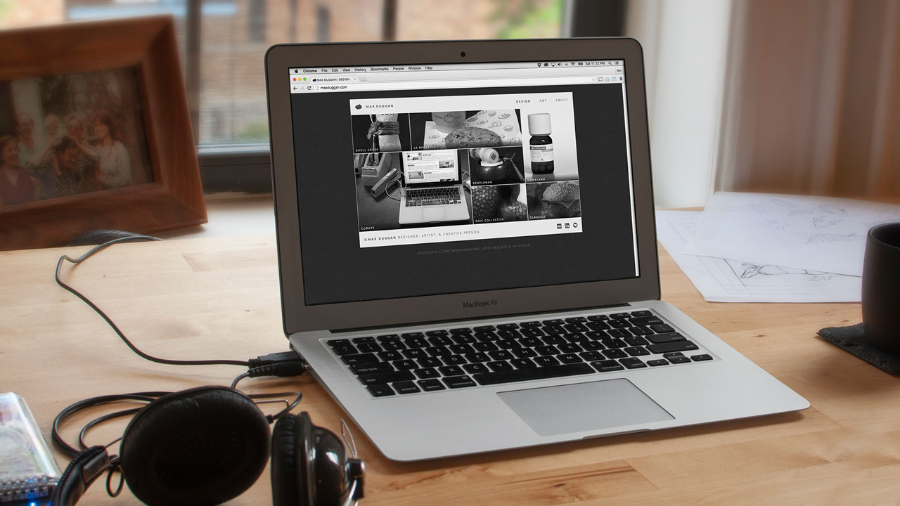
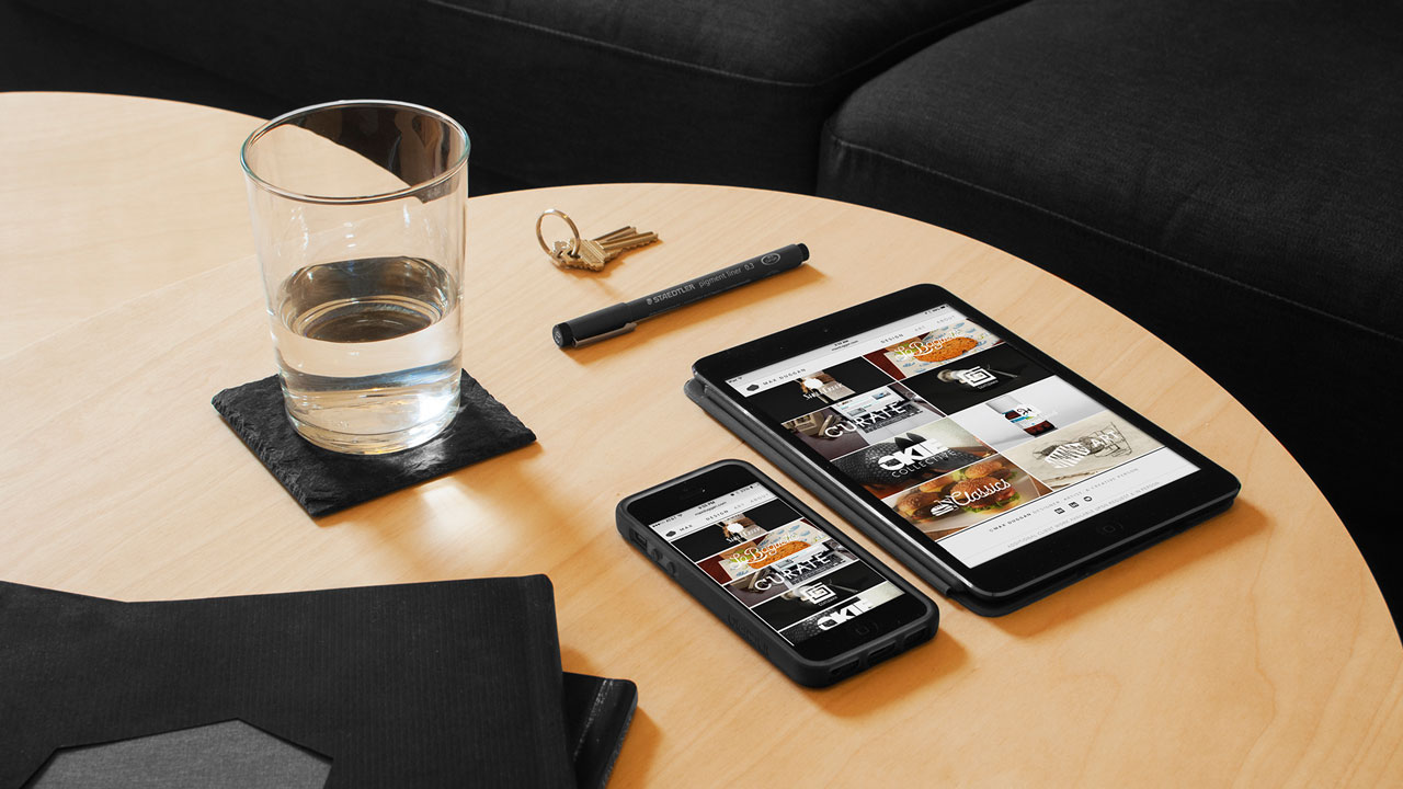
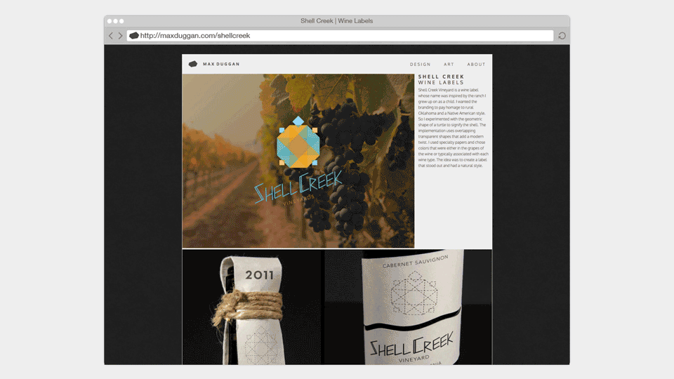
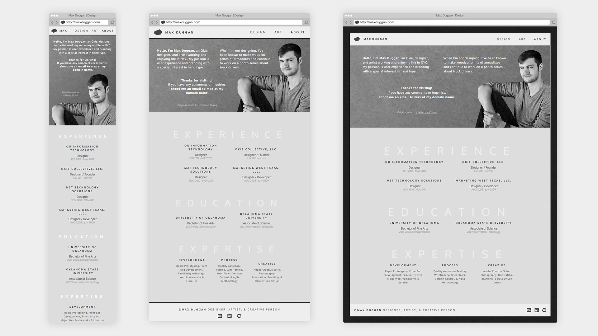
The first version of the site was an experimental grid system of 2px gutters with a series of enclosing boxes to achieve the abstract grid. This allowed me to greatly vary size of thumbnails and emphasize specific project. When upgrading the site to responsive, I kept the 2px abstract grid for desktop and worked backwards via two break points down to mobile. The site has a seperate touch version without hovers and other pointer based interactions. I used SVGs and CSS3 techniques that replaced sprites and large file sizes. Note the use of the logo as a unifing element in the lightbox navigation and custom back-to-top icon.
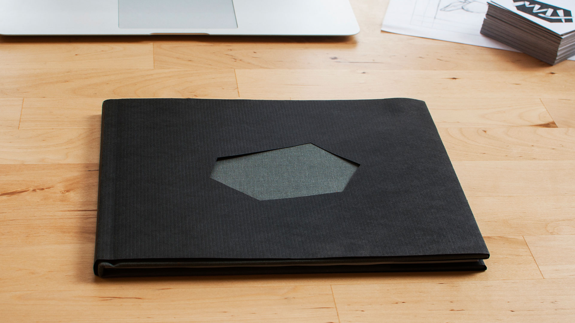
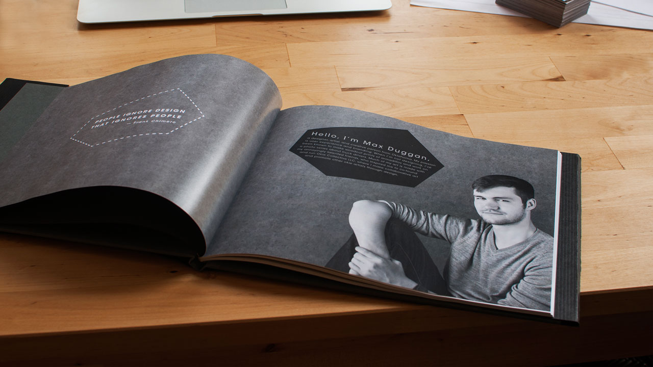
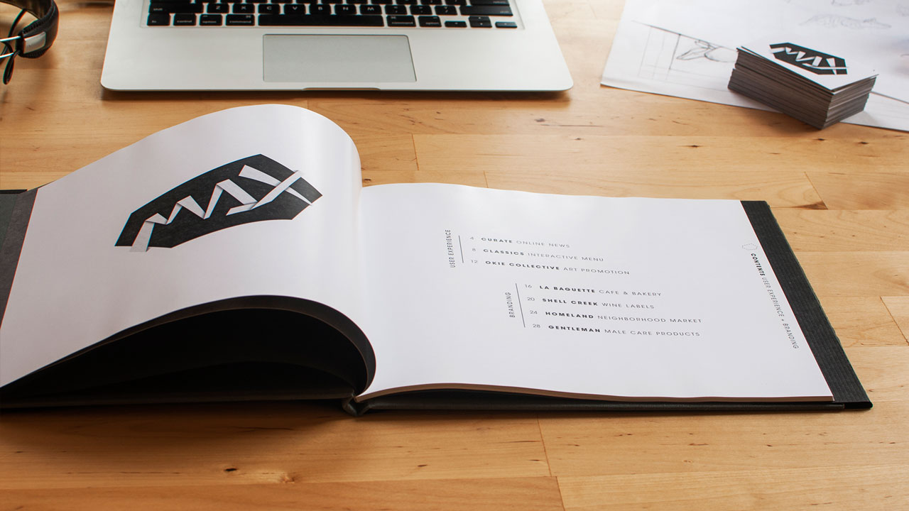
The print material features excesive white space and vertical type. The resume keeps a gutter that runs through the entire page and ties the content formatting to the title and footer. I experimented with the backs of the business cards to provide multiple variations of the logo. The portfolio book was bound in grey cloth and with a die cut the logo out of the center. The pages use the logo as a layout container to highligh text and page numbers.